

Email marketing can be a complex challenge for brands. Marketers who are used to creating campaigns using the same software on the same desktop can easily lose sight of the diversified environments available to engage with content and risk forgetting to optimise for mobile users.
As much as 42% of emails are opened on a mobile device, and this means that ensuring your content is as effective for smartphone browsers as it is for desktops should be at the top of your priority list.
Emails that aren’t effectively optimised for mobile can display incorrectly and altogether lose their intended effect. This can lead to lower click-through rates and even worse conversion rates as a result.
Considering that just one poor email campaign can permanently turn customers away from their email subscriptions with your brand, getting your copy right every time is a basic requirement, and you should take appropriate steps to ensure that your emails always have the right effect.
With this in mind, let’s take a deeper look at four essential reasons why your email campaigns could be less mobile-friendly than you may believe.
Quantifying the Benefits of Optimising for Mobile
Depending on your audience, mobile email open rates may account for between 26% to 78% of your target audience, depending on your customer profile, product, and email type.
Knowing your audience can be a key factor in determining the urgency of your mobile optimisation efforts. Sectors like B2C retail, travel, and events have an overwhelmingly large share of mobile open rates, while IT, online services, and education are all industries that maintain a relatively high desktop share of opens.
However, even in the largely desktop-based IT landscape, more than a quarter of email opens are via the use of mobile devices, so optimisation is still key.
Additionally, 71.6% of consumers are more likely to delete the emails they receive if they don’t look good on mobile.
This illustrates the imperative nature of mobile-friendly email campaigns. If you fail to optimise for mobile, your core email metrics will suffer–resulting in fewer clicks, lower conversion rates, weaker ROI, and high volumes of unsubscribers.
As a result, you could suffer from a lower brand reputation and weaker consumer trust. This is because you’re actively failing to live up to their expectations when they subscribe to your mailing list.
Let’s take a deeper look at what it means to optimise your email campaigns for mobile, and why you could be doing more harm than you may think when it comes to reaching the inboxes of your leads:
Your Crammed Content Limits Responsiveness
Here, it’s important to remember that email copy doesn’t adhere to the principles of search engine optimisation (SEO), and as a result, less really is more.
While long-form content with plenty of visual stimulation can be key ingredients to climbing Google’s SERPs, it can lead to sensory overloads for email inboxes. Instead, look to create short, easy-to-follow, and consumable chunks of copy that can be simple to digest.
To action this, look to more bullet-pointed lists, short paragraphs, and refrain from the temptation of florid language when getting your message across.
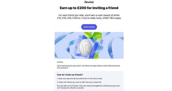
In the example above, we can see how it takes a fraction of a second to understand the purpose of this email from Revolut. The hook is one line long and immediately commands attention before one explanatory sentence and a call-to-action (CTA). Further down the email, we see an actionable and numbered how-to list for further information.
There are many reasons why it’s worth keeping things concise when optimising for mobile. While smaller screens play a key role, it’s also important to consider the limited attention spans of smartphone users and the fact that they could be opening your email from any location, meaning that they could be distracted at the point of engagement.
This means that catering to mobile also means catering to the demand for instant gratification that mobile users demand. If it’s unclear what your email is about within two seconds of opening, it’s unlikely that recipients will persevere with reading.
You Haven’t Added Touch-Friendly Elements
If you’re still linking back to your pages using text-based hyperlinks, you’re effectively alienating your mobile readers. In the past, we’ve all suffered the pain of attempting to click on a one-word-long hyperlink in the middle of a paragraph on our smartphones while only managing to zoom into the text as a result.
Avoid causing your mobile recipients the pain and suffering of clicking on text hyperlinks, and instead, opt for more CTAs or clickable images that stand out and are infinitely easier to actually click on.
This is one extremely effective way of boosting your click-through rates and is relatively easy to implement within your strategy.
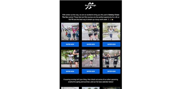
As we can see, buttons are far more effective and easy to identify as hyperlinks. The great thing about this is that your buttons can do the talking for you. This means that you can accompany them with optimized pictures and offer non-essential contextual information at the other end of the hyperlink once the recipient decides to follow up on their interest.
Your Copy Isn’t Suited to Small Screens
While this may not be the case for all email campaign content, a good rule of thumb is to stick to a single-column layout.
If you’re adding extra columns, it can be beneficial for more indulgent newsletters and essential information-heavy copy, but you’d better make sure that your recipients are using a desktop to digest your message.
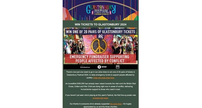
The single-column approach is perfect for catering to smaller mobile screens and can make copy far more readable. Additionally, it’s worth avoiding the temptation of detailed navigation bars, which can be too fiddly for mobile browsers, unreliable, and irrelevant to the expectations of mobile users.
Font size also counts for a lot when creating optimised copy for mobile devices. Consider using bold text for short, snappy lines or sentences, while creating a larger font to complement your concise approach.
Although these email campaign tactics can be a jarring change of pace for SEOs who are accustomed to more traditional content marketing and optimisation strategies, there’s a strong market of SEO agencies that specialise in mobile-friendly email campaigns that are designed to drive engagement and increase conversions.
Enlisting a specialist agency can be a suitable time-saving tactic for startups and SMEs that simply don’t have the resources to create optimised copy for email.
Your Images Haven’t Been Optimised for Mobile
Using images can make your email content look great for readers, and can bolster engagement rates significantly. However, cramming more pictures into emails can cause their loading times to become slower, drastically increase your risk of bouncebacks, and even put off customers from viewing your future emails.
To prevent this, it’s essential that you look to compress the images you add to your email campaigns.
It can be tempting to avoid taking action in compressing your images when you’re only adding a single picture, but it’s vital to remember that a number of your recipients could be using mobile data to view your message and may struggle with connectivity.
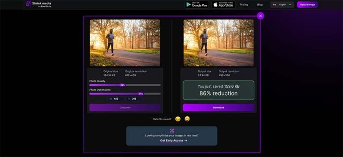
There are many image compression tools available online, and while Shrink.Media is listed as an example above, it’s certainly worth conducting some research to find a platform that suits your needs best.
Additionally, it’s never a good idea to use a single image as your main email content. Some email clients can automatically block images by default in recipient inboxes, and making your leads click ‘show images’ each time they receive an email from you could be one step too far for a seamless experience.
Always Think of Your Mobile Audience
Fundamentally, it’s time to make your mobile-based recipients a key consideration for all of your email campaigns moving forward.
Before distributing content to your mailing list, be sure to always view the copy using an iOS and Android browser to ensure that there are no unfortunate mistakes or unforeseen issues.
When it comes to optimizing click-through rates, there can be no more effective strategy than to simply spend more time catering to your large pool of mobile-based customers. For the time you’ll allocate to thinking of them, you’re likely to be rewarded in your bottom line.
- Custom web design
- Secure and fast website solution
- Full management training
- Take control of your website
- SEO optimisation
- Reliable web hosting and emails
Article by Pankaj Shah: DCP Web Designers in London