

In today’s digital world, users access websites from a variety of devices, including desktops, tablets, and smartphones. To ensure a seamless user experience across different screen sizes, web developers use responsive design breakpoints. But what exactly are breakpoints, why are they important, and how are they implemented in modern web design? In this article, we’ll explore everything you need to know about breakpoints in responsive website design.
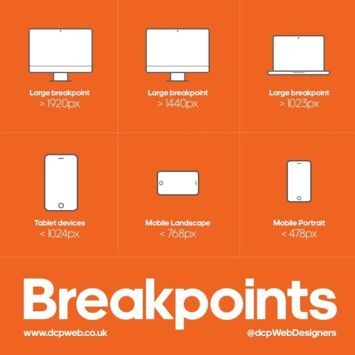
What Are Breakpoints in Responsive Web Design?
Breakpoints are specific screen widths at which a website’s layout adjusts to provide an optimal user experience. They are defined in CSS media queries and help ensure that content is displayed correctly on different devices.
For example, a website may look one way on a desktop (1200px width), another way on a tablet (768px width), and yet another way on a mobile device (480px width or less).
Common Breakpoints Used in Web Design
While breakpoints can be customized, developers typically follow industry standards for different device categories:
- Large Desktop: 1200px and above
- Standard Desktop: 992px – 1199px
- Tablet (Portrait & Landscape): 768px – 991px
- Mobile (Landscape): 576px – 767px
- Mobile (Portrait): 320px – 575px
These breakpoints allow web developers to create fluid, adaptable designs that enhance user experience.
Why Are Breakpoints Important?
1. Enhancing User Experience
Breakpoints help ensure that a website looks good and functions well on all devices. Without them, users may experience distorted layouts, unreadable text, or broken navigation menus.
2. Mobile-First Approach
With mobile usage surpassing desktop browsing, it’s crucial to design websites with mobile users in mind first. Breakpoints allow designers to start with a mobile layout and scale up for larger screens.
3. Improved SEO and Ranking
Google prioritises mobile-friendly websites in search rankings. By implementing responsive design with proper breakpoints, websites meet Google’s mobile-first indexing requirements, improving their chances of ranking higher.
4. Faster Load Times
A well-implemented responsive design loads only the necessary assets based on a user’s device. This prevents unnecessary loading of large images or scripts, improving page speed and reducing bounce rates.
5. Cost-Effectiveness
Rather than developing separate websites for mobile and desktop users, breakpoints allow businesses to maintain one website that adapts to all screen sizes, saving both time and development costs.
How to Use Breakpoints in Modern Web Development
1. Using CSS Media Queries
Media queries allow developers to apply different styles depending on the screen size. Here’s an example of how they are used:
/* Styles for large desktops */
@media (min-width: 1200px) {
body {
font-size: 18px;
}
}
/* Styles for tablets */
@media (max-width: 991px) {
body {
font-size: 16px;
}
}
/* Styles for mobile devices */
@media (max-width: 576px) {
body {
font-size: 14px;
}
}
In this example:
- Desktop users get larger fonts.
- Tablet users see moderate font sizes.
- Mobile users get smaller fonts for readability.
2. Using a Mobile-First Approach
Modern web development practices recommend starting with mobile styles first, then using media queries to scale up. Example:
/* Default styles (for mobile first) */
body {
font-size: 14px;
}
/* Adjust styles for tablets and larger screens */
@media (min-width: 768px) {
body {
font-size: 16px;
}
}
@media (min-width: 1200px) {
body {
font-size: 18px;
}
}
3. Implementing Flexbox and Grid for Layout Adjustments
CSS Flexbox and Grid make it easier to design responsive layouts without relying on fixed pixel values. Example:
.container {
display: flex;
flex-wrap: wrap;
justify-content: space-between;
}
/* Stack elements vertically on smaller screens */
@media (max-width: 768px) {
.container {
flex-direction: column;
}
}
4. Using Frameworks Like Bootstrap
Popular CSS frameworks like Bootstrap come with built-in breakpoints, making it easier to implement responsive designs without writing custom media queries. Example:
<div class=”col-md-6 col-lg-4″>Responsive Column</div>
Here:
col-md-6applies a 6-column layout on tablets (>=768px).col-lg-4applies a 4-column layout on larger screens (>=992px).
5. Testing with Developer Tools
Modern browsers, such as Google Chrome, offer built-in developer tools that allow testing breakpoints on different screen sizes. Simply right-click → Inspect Element → Select Responsive Design Mode.
Best Practices for Using Breakpoints
- Avoid Too Many Breakpoints: Stick to major device categories (desktop, tablet, and mobile) to maintain simplicity.
- Use Relative Units: Use
em,%, andreminstead of fixed pixel values (px) for better scalability. - Test on Real Devices: Emulators are useful, but testing on real smartphones and tablets gives a more accurate representation.
- Optimise Images: Serve different image sizes using
srcsetfor different screen resolutions to improve performance.
Conclusion
Breakpoints are an essential part of modern website design, ensuring that websites function well on any screen size. By using CSS media queries, a mobile-first approach, Flexbox/Grid, and frameworks like Bootstrap, developers can create user-friendly, fast, and SEO-optimised websites.
If you’re designing a website, understanding and correctly implementing breakpoints is key to delivering an excellent user experience across all devices.
At DCP Web Designers, we build fast, responsive WordPress websites that are designed to perform on every device. Every website is created with mobile usability, SEO, accessibility and long-term growth in mind. If you’re planning a new website or looking to improve an existing one, contact our Website Design London team to discuss your project and discover how we can help your business succeed online.