
Pankaj Shah web agency director in London with over 20 years of experience in web design and project management

I hope you enjoy reading our blog posts.

If you want DCP to build you an awesome website, click here.

4 Practical Use Cases for CSS Grids in Modern Web Design

CSS Grid is a powerful layout system that has transformed the way web designers structure and style websites. It provides a flexible, two-dimensional grid-based approach, making it easier to create complex layouts without the need for excessive code or tricky workarounds.
Css grids use cases v1

In this infographic blog post, we’ll explore four practical use cases for CSS Grids that can elevate your web design projects.

Building Stunning Image Galleries
Css grids use cases v2

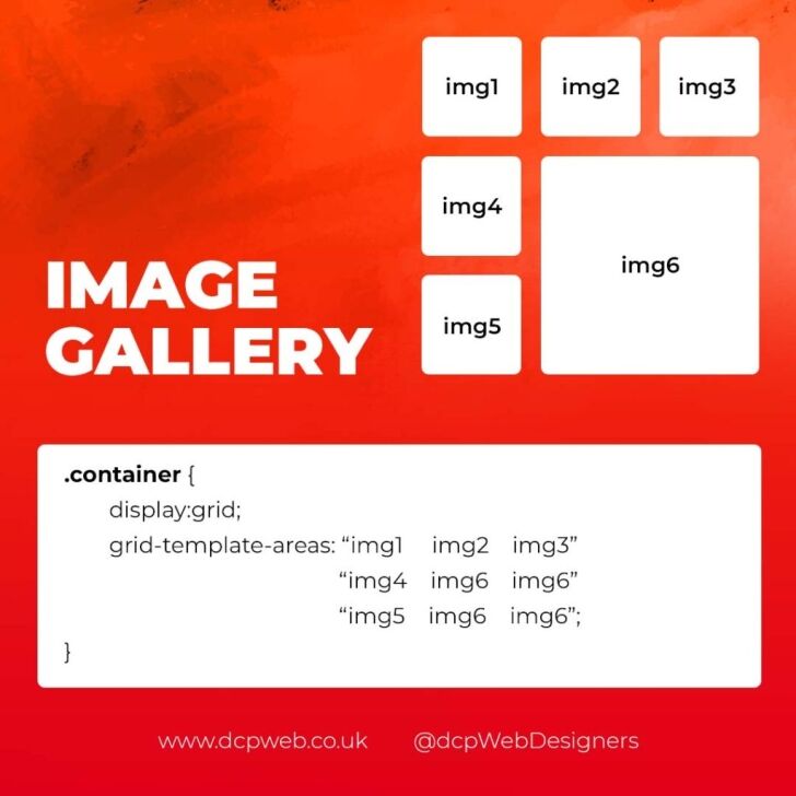
Image galleries are a staple in modern web design, and CSS Grid is an ideal tool for creating them. Unlike traditional layout methods, CSS Grid allows you to define precise rows and columns, making it easy to align images without breaking the overall design.

Why Use CSS Grid for Image Galleries?

  • Flexible Layouts: Easily control the number of columns and rows based on screen size.
  • Gap Control: Use the grid-gap or gap property for perfect spacing.
  • Responsive Design: Adjust column sizes and row heights without breaking the layout.
  • Layering and Positioning: Position images in creative ways, including overlapping elements.

Basic Image Gallery Example

<div class=”gallery”>
<img src=”image1.jpg” alt=”Image 1″>
<img src=”image2.jpg” alt=”Image 2″>
<img src=”image3.jpg” alt=”Image 3″>
<img src=”image4.jpg” alt=”Image 4″>
<img src=”image5.jpg” alt=”Image 5″>
</div>

.gallery {
display: grid;
grid-template-columns: repeat(auto-fill, minmax(200px, 1fr));
gap: 16px;
}
.gallery img {
width: 100%;
display: block;
border-radius: 8px;

Advanced Image Gallery Layouts

Experienced web designers can also create more intricate layouts by spanning images across multiple rows or columns using the grid-column and grid-row properties, giving your galleries a more dynamic and polished look.

Creating Main Website Layouts
Css grids use cases v3

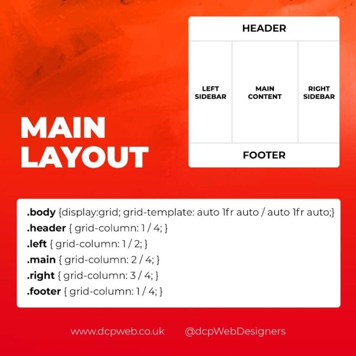
CSS Grid shines when it comes to designing the main structure of a website. Whether you’re building a blog, portfolio, or business website, grids provide the framework for responsive and organised layouts.

Why Use CSS Grid for Main Layouts?

  • Clear Structure: Define headers, sidebars, content areas, and footers precisely.
  • Responsive Design: Create layouts that adapt effortlessly to different screen sizes.
  • Efficient Code: Reduce the need for excessive wrapper divs and floats.
  • Complex Designs: Easily create overlapping sections and layered effects.

Basic Main Layout Example

<div class=”main-layout”>
<header>Header</header>
<nav>Navigation</nav>
<main>Main Content</main>
<aside>Sidebar</aside>
<footer>Footer</footer>
</div>

.main-layout {
display: grid;
grid-template-areas:
“header header header”
“nav main sidebar”
“footer footer footer”;
grid-template-columns: 1fr 2fr 1fr;
gap: 20px;
}
header { grid-area: header; }
nav { grid-area: nav; }
main { grid-area: main; }
aside { grid-area: sidebar; }
footer { grid-area: footer; }

Advanced Main Layouts

For more complex designs, consider using CSS Grid in combination with Flexbox for greater flexibility and control over nested elements.

Designing Attention-Grabbing Banners
Css grids use cases v4

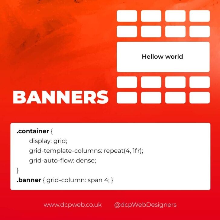
Banners are crucial for grabbing user attention, and CSS Grid makes it easy to create stunning, multi-layered designs without relying on complex positioning hacks.

Why Use CSS Grid for Banners?

  • Flexible Positioning: Easily place text, images, and buttons exactly where you want them.
  • Responsive Design: Maintain structure across different devices.
  • Layer Control: Use grid layers to create engaging, multi-dimensional designs.

Basic Banner Example

<div class=”banner”>
<div class=”overlay”></div>
<h1>Welcome to Our Website</h1>
<p>Discover our range of services.</p>
<button>Learn More</button>
</div>

.banner {
display: grid;
grid-template-areas: “overlay”;
position: relative;
background-image: url(‘banner.jpg’);
background-size: cover;
background-position: center;
height: 300px;
color: #fff;
text-align: center;
}
.overlay {
grid-area: overlay;
background-color: rgba(0, 0, 0, 0.6);
position: absolute;
top: 0;
left: 0;
right: 0;
bottom: 0;
z-index: 1;
}
.banner h1, .banner p, .banner button {
position: relative;
z-index: 2;
}

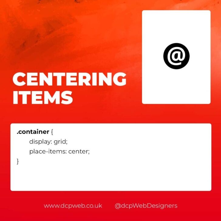
Perfectly Centring Items
Css grids use cases v5

Centred layouts are a common design choice, and CSS Grid provides a simple way to centre content without relying on margin hacks or flexbox tricks.

Why Use CSS Grid for Centring?

  • Simplicity: One line of code can achieve perfect centring.
  • Cross-Browser Support: Reliable centring across all major browsers.
  • Versatility: Works for both single items and entire sections.

Basic Centring Example

<div class=”centre”>
<h2>Centred Content</h2>
</div>

.centre {
display: grid;
place-items: center;
height: 300px;
background-color: #f4f4f4;
}

Conclusion

CSS Grid is an incredibly versatile tool that can streamline your web design workflow, reduce code complexity, and enhance the overall user experience.

Whether you’re building image galleries, main layouts, banners, or perfectly centred designs, CSS Grid offers a flexible and powerful solution.

Experiment with these practical use cases to unlock the full potential of CSS Grid in your projects.


Author

Picture of Pankaj Shah

Pankaj Shah

Pankaj Shah is the founder of DCP Web Designers, an award-winning London-based web design and digital marketing agency. With over 20 years of experience, he specialises in WordPress web design, WooCommerce, SEO and helping businesses build effective online solutions.
Tell Us Your Thoughts

This website (dcpweb.co.uk) uses cookies to improve your browsing experience and help us understand how our site is used. By continuing to browse this website, you agree to our use of cookies.

To learn more about how we collect, use, and protect your data, please read our Privacy Policy.

Since 2004, we have designed and developed websites for companies across a wide range of industries, from local service businesses to ecommerce brands and professional organisations.

Our focus is on creating websites that not only look professional, but also perform well in search engines, attract the right audience and support long-term business growth.

If you are looking for experienced web designers who understand how to build websites that deliver real results, our team is here to help.

Privacy Policy

Last Updated: 01/07/2024

Different Colour Productions Ltd (“we,” “us,” or “our”) is committed to protecting your privacy. This Privacy Policy outlines our practices concerning the collection, use, and disclosure of personal information when you visit our website or engage with our services. By using our website and services, you consent to the terms outlined in this Privacy Policy.

1. Information We Collect

We collect various types of information to provide and improve our services. The types of information we may collect include:

1.1. Personal Information: This may include your name, email address, phone number, and any other information you provide when you contact us, request information, or subscribe to our newsletter.

1.2. Log Data: When you visit our website, we automatically collect information, such as your IP address, browser type, pages visited, and the time and date of your visit.

1.3. Cookies and Similar Technologies: We use cookies and other tracking technologies to improve your experience on our website. You can adjust your browser settings to reject cookies or be alerted when cookies are being used.

2. How We Use Your Information

We use the collected information for various purposes, including:

2.1. Providing Services: To provide web design and related services you have requested from us.

2.2. Communication: To respond to your inquiries, send updates, and provide customer support.

2.3. Analytics: To analyse and improve our website and services, as well as monitor usage patterns.

3. Information Sharing and Disclosure

We do not sell or rent your personal information to third parties. However, we may share your information with third parties under the following circumstances:

3.1. Service Providers: We may share your information with trusted service providers who help us deliver our services, such as hosting providers, analytics providers, and marketing services.

3.2. Legal Obligations: We may disclose your information when required by law, to comply with legal processes, or to protect our rights, privacy, safety, or property.

4. Your Choices

You have choices regarding your personal information:

4.1. Access and Update: You can access and update your personal information by contacting us.

4.2. Marketing Communications: You can opt out of receiving marketing communications from us by following the unsubscribe instructions in our emails or emailing [email protected]

5. Security

We take appropriate measures to protect your personal information from unauthorised access, disclosure, alteration, or destruction.

6. Links to Other Websites

Our website may contain links to third-party websites. We are not responsible for the privacy practices of these websites. We recommend reviewing their respective privacy policies.

7. Changes to this Privacy Policy

We may update this Privacy Policy from time to time to reflect changes in our practices. Any changes will be posted on this page, and the date at the top will indicate the latest update.

8. Contact Us

If you have any questions or concerns about this Privacy Policy or our practices, please contact us at: [email protected]

By using our website and services, you acknowledge that you have read and agree to this Privacy Policy. Different Colour Productions Ltd is committed to safeguarding your personal information and respecting your privacy rights.

ThreeBestRated Top 3 Website Designers in London 2026 award for DCP Web Designers Certificate